SOO Photography Auction Fundraiser
Read more...
So this countdown is actually for three items...so maybe it's be more like #6, #5.5 and #5? You really use all three simultaneously and none of them work without the other two. But it didn't seem fair to take up three whole spots...and conversely, didn't seem right to cram three items into one spot! As a compromise, I decided to take up two real spots and add in a half spot. It doesn't make sense, I know. Just play along, okay? :)
| source |
Here's another school project I've been wanting to share with you. The assignment was to pick a book that has already been published and redesign the cover. I chose to do a book jacket so I could design the inside flaps too. :)
A lot of the Wizard of Oz covers I've seen in the past incorporate ornate, decorative elements, particularly in the use of fonts. I decided to put a fresh spin on it by using a hand-drawn text style in addition to some graphics that I sketched out, scanned, and colored in Illustrator. My favorite part of the book is the little hot air balloon graphic which I put in the author section under the line, "He left this world on May 5, 1919." Teehee. :)


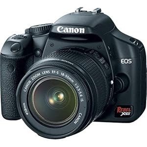
#9 - Digital Camera
I have an awesome sister who gifted us a DSLR when we got married a couple years back, and it's one of the things that you could argue is not really a design or crafting tool, but I'm going to make a case for it.
I got my first digital camera in college when I convinced my parents that I NEEDED one for my architecture studio classes. How else was I supposed to take pictures of my intricate basswood models creating interesting shadows on the sidewalk? Really, though, I think documentation is a large component in the process of design. When you're documenting your project and looking at it through the lens of a camera, you see your project in a more objective manner. You can more clearly see all the areas in which you did well, and all the areas that needed improvement. It also helps to have a physical record of all your work once the work has been given away, tossed in the trash, or destroyed. And as you collect more work, you'll start to see your growth and development in your design style.
On the other end, a digital camera is essential in the beginning stages of a project when you're searching high and low for that perfect source of inspiration that's going to be your next big thing. Inspiration never comes when it's supposed to, so you always have to be ready to capture it immediately when you happen to come across it. A sketchbook is great, but nothing is quicker and easier than snapping a quick photo of an object that you want to keep in your inspiration bank to pull out later on.
All that being said, you definitely don't need a fancy, expensive camera to do any of this at all. Honestly, since I've gotten my iPhone, it's replaced my small digital camera that I used to keep in my purse at all times, and I hardly ever take my SLR with me anywhere anymore. I use my SLR solely for documentation and taking pics for this blog. But when I'm out and about, my iPhone serves me perfectly as a quick snap and go camera. (Btw, has anybody seen the camera on the new iPhone 4s? It's AMAZING! Plus, check out these nifty lens attachments for your camera phone!! I've been hinting to Dean about these because Christmas is coming up... :D)
It was hard, but after sifting through all my crafting and design tools, I finally managed to whittle my must-have list down to my 10 most essential items. So I'm going to start today by talking about #10! Just as a disclaimer, I'm not being sponsored by anybody or being told to endorse these products. These are simply products and tools that I've used and loved and want to share with you.#10 - Scanner
I have a CanoScan LiDE 110 that I got for Christmas a few years ago that I absolutely love. I feel like most scanners basically do the same job getting documents and images scanned. What sets this one apart for me is the portability and the fact that it only has one cord. All I have to do is use one simple cord to connect my scanner to my laptop and that's it. No power cord to deal with! The scanner is powered by your computer, thus making it more energy efficient too. Score. I literally store this scanner in my bookshelf. It takes up less space than my Martha Stewart Encyclopedia.I use my Scanner a lot when I'm creating custom artwork for illustrations or when I want to use specific elements of existing artwork. For example, for Cathy and Dan's invitations, I hand-sketched the peapod, scanned it into an Illustrator file, and applied stroke effects and color digitally. It's oftentimes a lot easier to work out your ideas on paper and draw it by hand than to try working on computer solely.
Stay tuned for #9 next week!
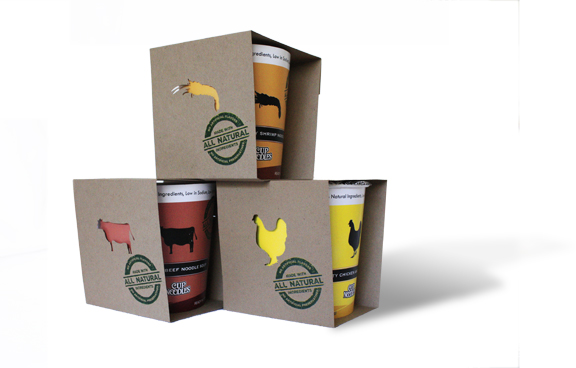
We all have memories of eating Cup Noodles - late nights in college, lunches on the go....midnight snacks at camp. My grandma even packs a few with her to eat on the airplane when she's traveling long distances. It's no question that Cup Noodles are a super quick and cheap option for a meal. But what if they were also healthy and packaged in a way that was environmentally responsible too?
These were just some of the questions that I tried to address in my package design project for one of my classes. The redesigned Cup Noodles features environmentally friendly ecotainer cups that are 100% recyclable and the outer packaging is made entirely from post-consumer waste. The actual noodles themselves are manufactured with an air-drying process to dehydrate the noodles, rather than deep-frying them in oil to flash-dry them. They are also made with all natural, organic ingredients. The new Cup Noodles is a product that is entirely sustainable - for you, and for the earth. 
P.S. I used my handy-dandy Silhouette SD to cut out those animal shapes! I felt justified knowing that I could use my Silhouette for "real" projects and not just crafts...haha.

Let me introduce you to Elmer. We met in typography class last week. He loves peanuts and cheddar cheese (though he's been rather reluctant to indulge in the latter recently; he's watching his weight). He also has an affinity for beautiful fonts and smart design.
Elmer was part of an in-class exercise to create an animal using only type. The exercise helped us recognize and appreciate letters as shapes, lines, and beautiful forms.
Well, there's actually only one more month of summer left, but I wanted to share with you a little project I did for our summer camp this year. To help generate excitement for camp and to help with marketing a bit, we came up with the idea of having buttons/pins that corresponded with each week's theme. Some of the themes we had included Pirate Week Crafty Creations, Camping Week, Gamerz, Entrepreneur Week, and Hollywood Glam, to name a few. The children were encouraged to come each week, receive their collectible button, and redeem them at the very end for exciting prizes!
For the icons, I used a lot of the pre-made ones available in Illustrator and also created a few of my own to add to the mix. I assigned each icon an appropriate color to help further distinguish each week from the next.
We ended up getting this button machine and starter kit from Badge-A-Minit because they had the most affordable option for our purposes. It's definitely not as nice as an automatic one, but for the quantities that we needed, it worked just fine! It takes a little practice to get it just right though.
Here's a wall display I created to let all the children and parents know about our weekly themes.
A couple months back, my friend Karen contacted me about designing and printing some baby announcement cards for her new baby girl, Emma. She was looking for something sweet and simple, and also wanted to incorporate a baby lambie to match the nursery.
Here's what we came up with:
Congrats again on the newest addition to your family, Karen and Paul!

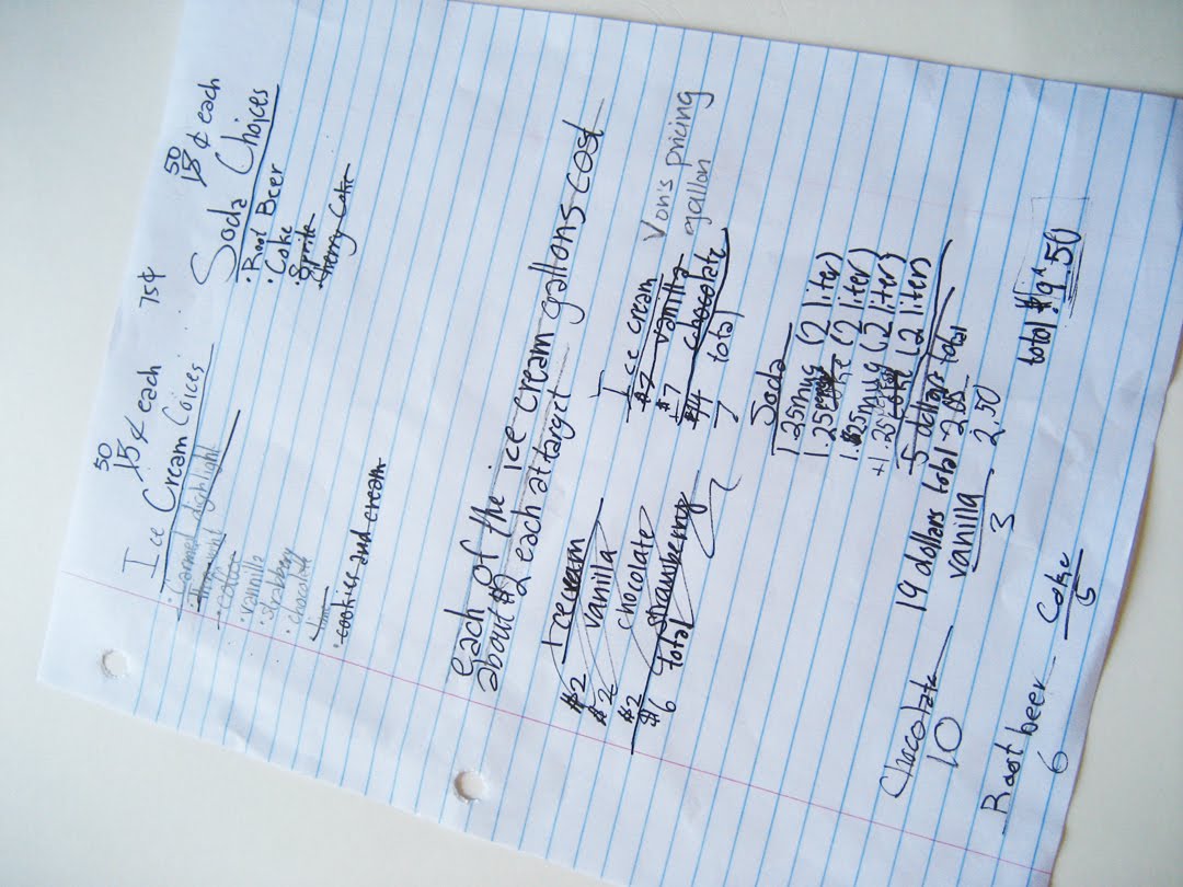
One of our themes during Spring Camp for the kids was "Entrepreneur Day" where we asked them to brainstorm business ideas, and then to come up with a plan and strategy to execute their business ideas. The group I worked with decided to open up a Rootbeer float shop that they named Floating Cream.
They did all the research as to how much ice cream and Rootbeer cost, estimated how much they would need, how much to price the floats, and even conducted a customer survey with their peers to see which flavors of ice cream and soda they liked best.
After that, they designed their logo and marketing materials, including custom cup wrappers, brochures, flyers, and a poster for the shop table.

The shop was such a smashing success, we've since re-opened it every Friday! I'm so proud of the work they did, from their thoughtful design process to their business-savvy in conducting marketing research and advertising to their excellent customer service!
One of my architecture teachers once told me that architecture is often underappreciated because when architecture is successful, it creates a seamless experience that provides the user with comfort, ease and functionality. Therefore, more often than not, good architecture is ignored. On the other hand, bad architecture draws attention to itself with complaints like the ceiling's too low, there's not enough natural light, the space feels cramped, etc.
I always thought that I agreed with her because it did seem true - nobody usually notices good architecture unless it's built by a famous architect, is historical or ancient, or is pointed out by a an architect friend/teacher/colleague.
But after visiting the Eames House, the home of the great American designers and architects, Charles and Ray Eames, I think that Great Architecture, in addition to providing comfort, ease, and functionality, creates spaces that people want to be in. They're spaces where you linger on your way to class or work. Spaces where you retreat to when you seek solace and refreshment. Spaces that you long to be in because there's just that something special there that you can't quite put your finger on. Spaces that actually enhance your quality of life.


As I wandered around the Eames House, peeked in the windows, and ran through the meadow, I said to Dean, "Wow, this is the kind of place where I want to raise our children!" I felt a little like Alice being transported to the fantastical world of Wonderland. I fell in love with all the little details of the house, like its proximity to the ocean, the presence of nature in, around, and surrounding the house, and all the little touches of whimsy and wonder that delighted you around each corner. What a perfect place for a young child (or children of all ages) to exercise their imagination and play!

Each window into the home of Charles and Ray revealed moments of their creative lives together. They loved to read, and throw parties, and be with and around nature, and make toys and films and furniture. They had created for themselves a space where "work, play, life, and nature co-existed." Their home was modern and tasteful, but with so many touches of warmth and friendliness. You could tell that this was a home where life was treasured, shared, and lived to the fullest. 


I hope someday to have a home like that too.
© Rebecca Thongkham 2010
© Blogger template Shush by Ourblogtemplates.com 2009
Back to TOP